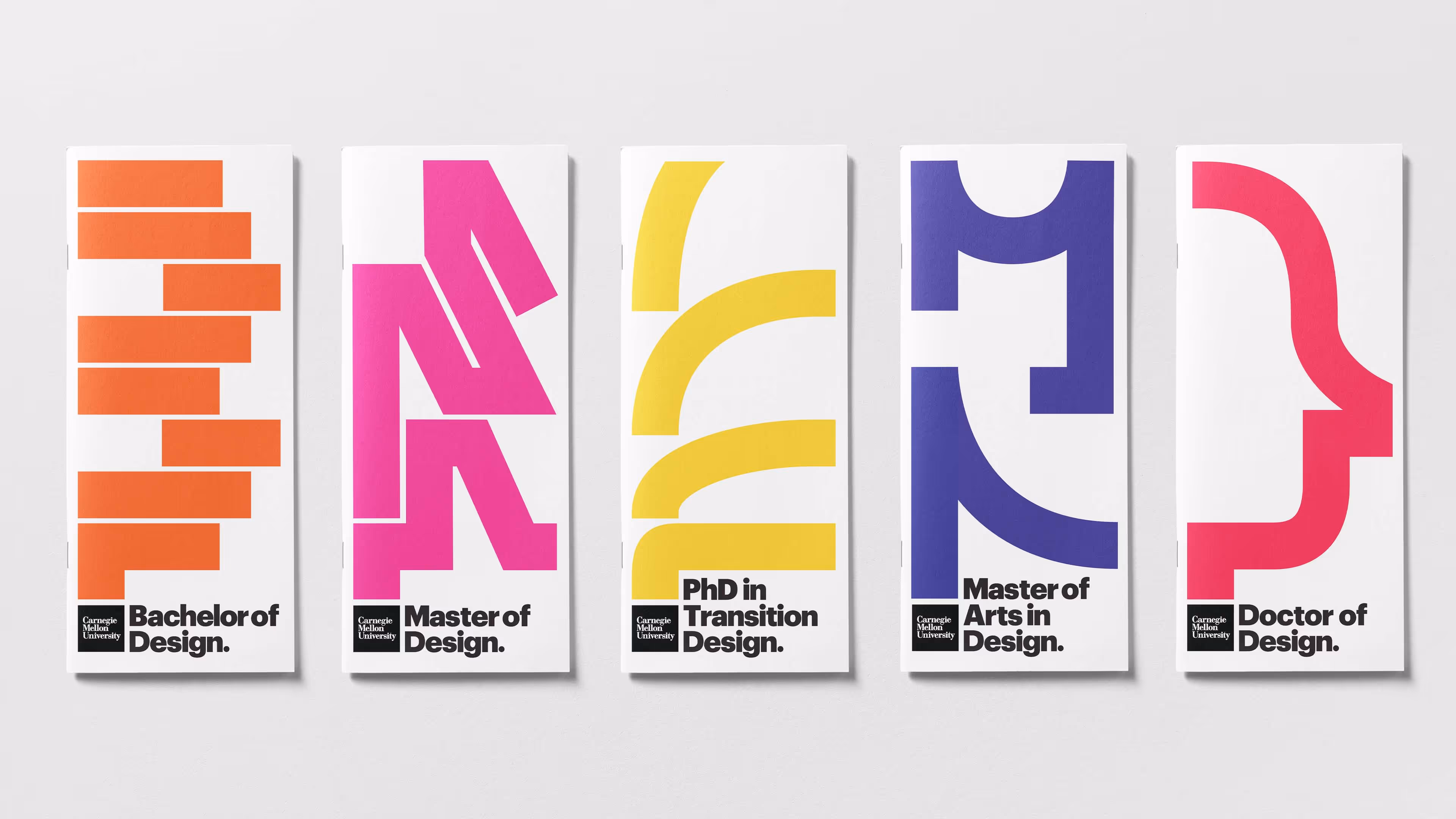
Internal facing touch points take on a more technical tone to celebrate craft.
The orange banner on display cases have been improved with a flexible naming system. Students and Faculty can print out white strips to title work.
Oftentimes, braille is treated as secondary. In this new set of placards, braille is brought forward to reveal the beauty in its structure alongside the logotype. This is rooted in the School’s emphasis to actively make design universal.
Alongside the release of the new identity system, the “Make it all in Design” campaign reflects the School’s newfound commitment to actively decrease the barrier of entry into a design education.
In researching the CMU’s School of Design application progress, our team noted a key barrier to submitting an application—the lack of a simple explanation as to what design actually is and how this definition can change based on who, in particular, is applying. As a result, we developed a multi-media campaign that emphasizes current and past students’ work combined with text that feels like a casual conversation.
Campaign Collaborators:
Mia Tang - Web Portal
Alice Cai and Angela Lee - Creative Direction
Yoshi Torralva - Visual Ideation, Brand Extension, and Production
The “Make it all in Design” tagline refers to the School’s diverse curriculum which allows students to explore their own interests. Throughout the campaign, the tagline’s layout is flexible throughout the poster, website and drawing activity.
The campaign offers a unique opportunity for high school students to actively engage in design.
A collection of some of my experiments for the drawing activity before arriving at the final form.
.
Project Credit
Yoshi Torralva — Designer
Brett Yasko — Project Manager
Dylan Vitone — Project Manager
.