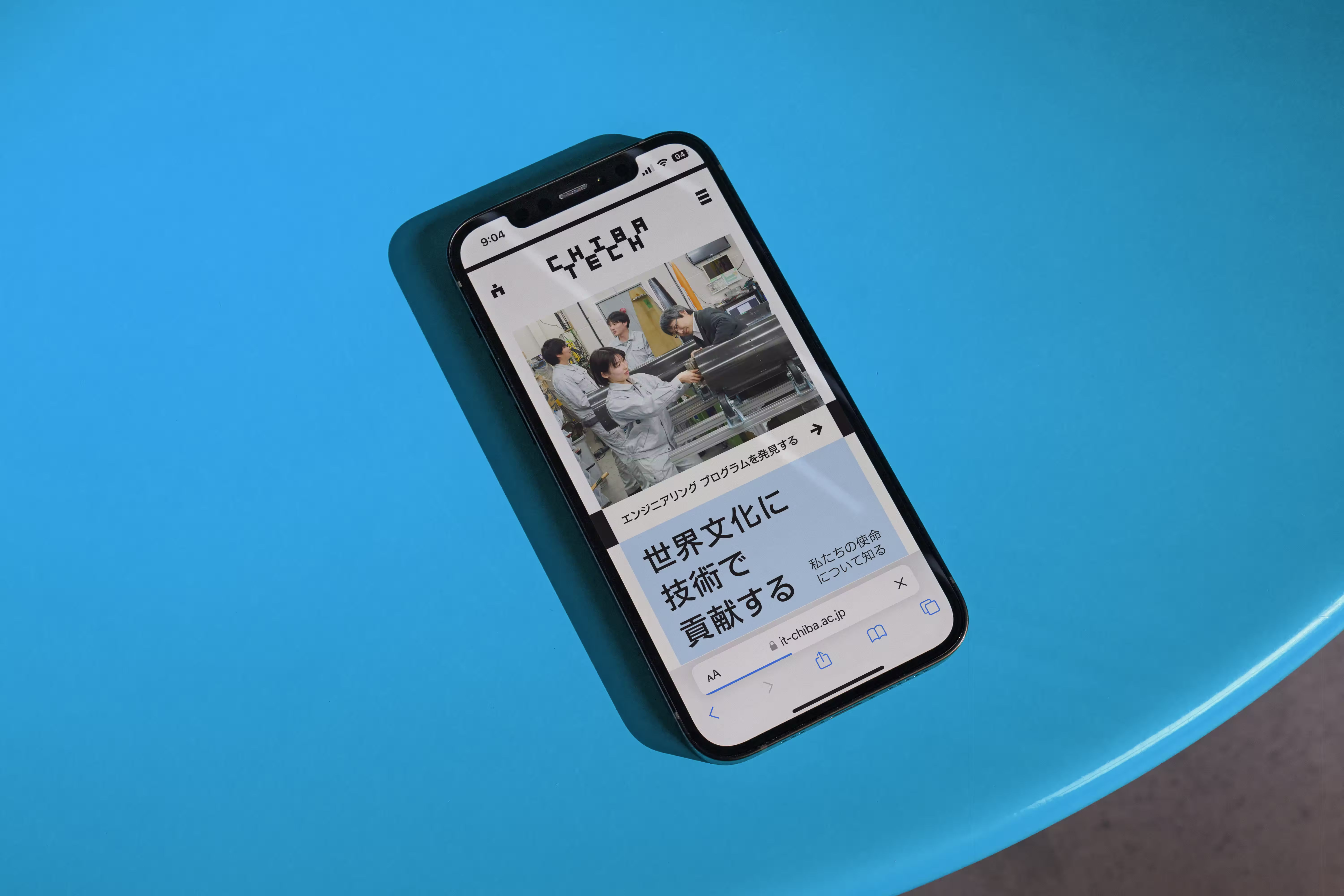
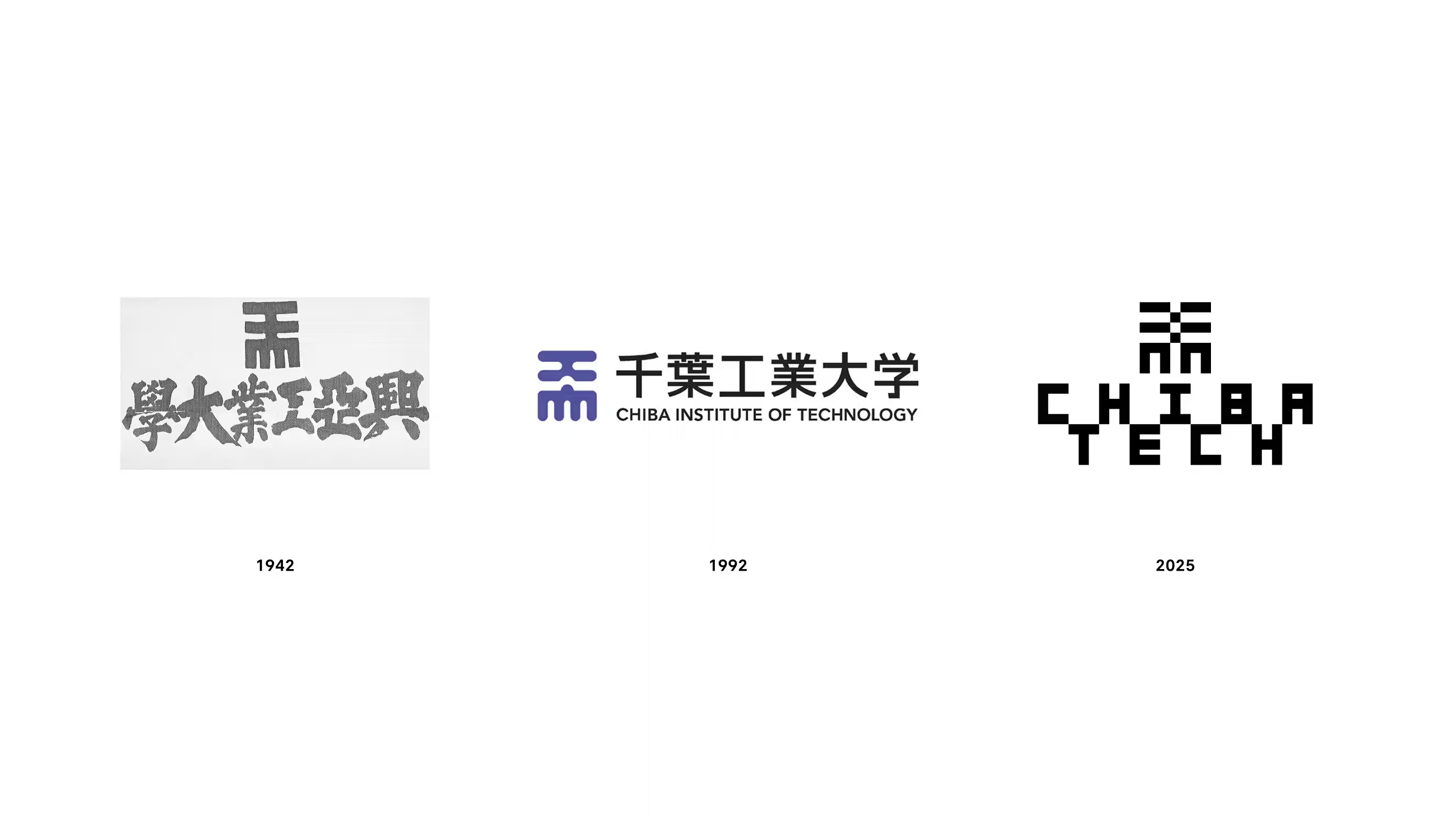
A rebrand of a legacy technology institute in Japan that celebrates its heritage and articulates new ambitions.
Client: Chiba Tech
Brand Identity // 2023 // Lead Designer @ Pentagram
Brand Identity // 2023 // Lead Designer @ Pentagram
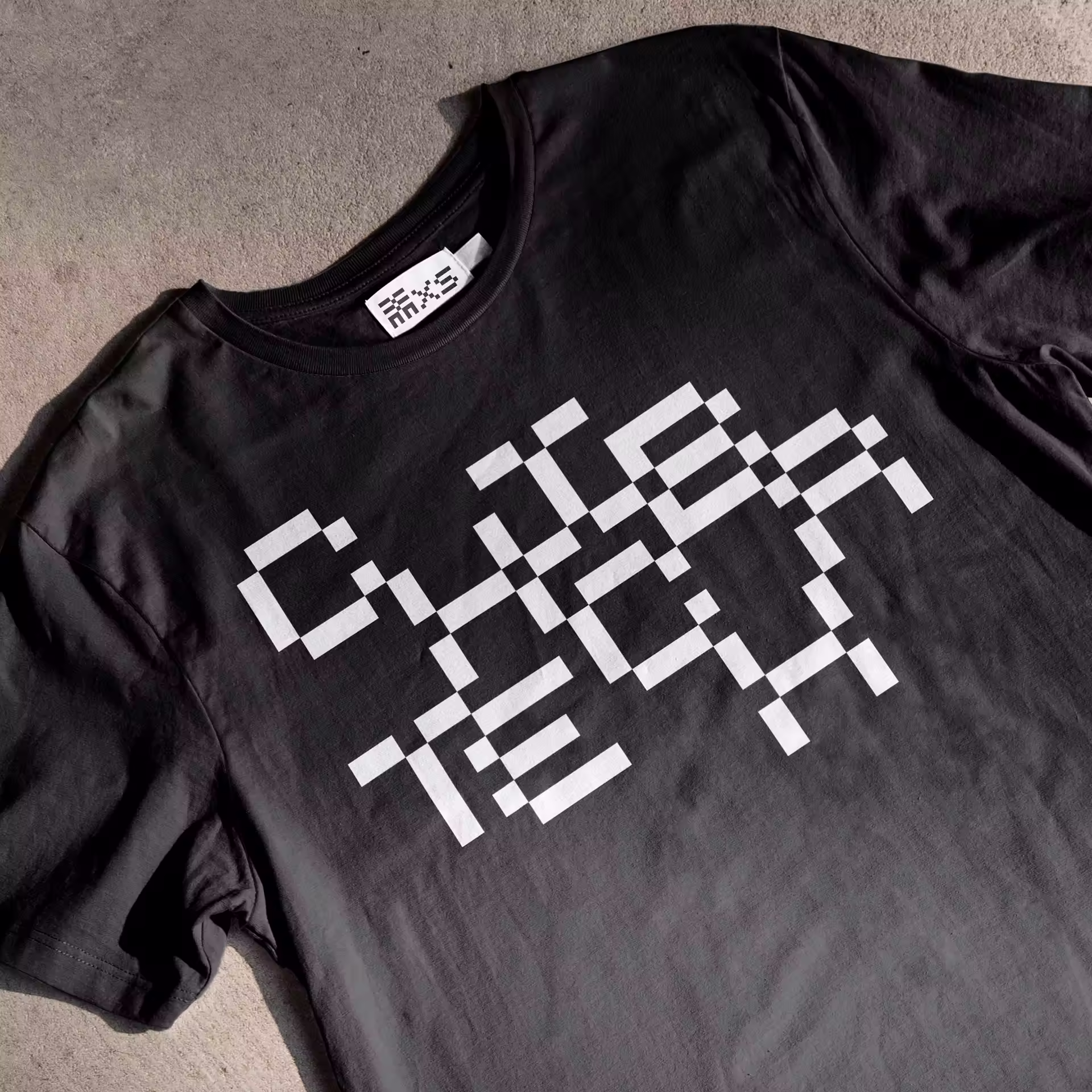
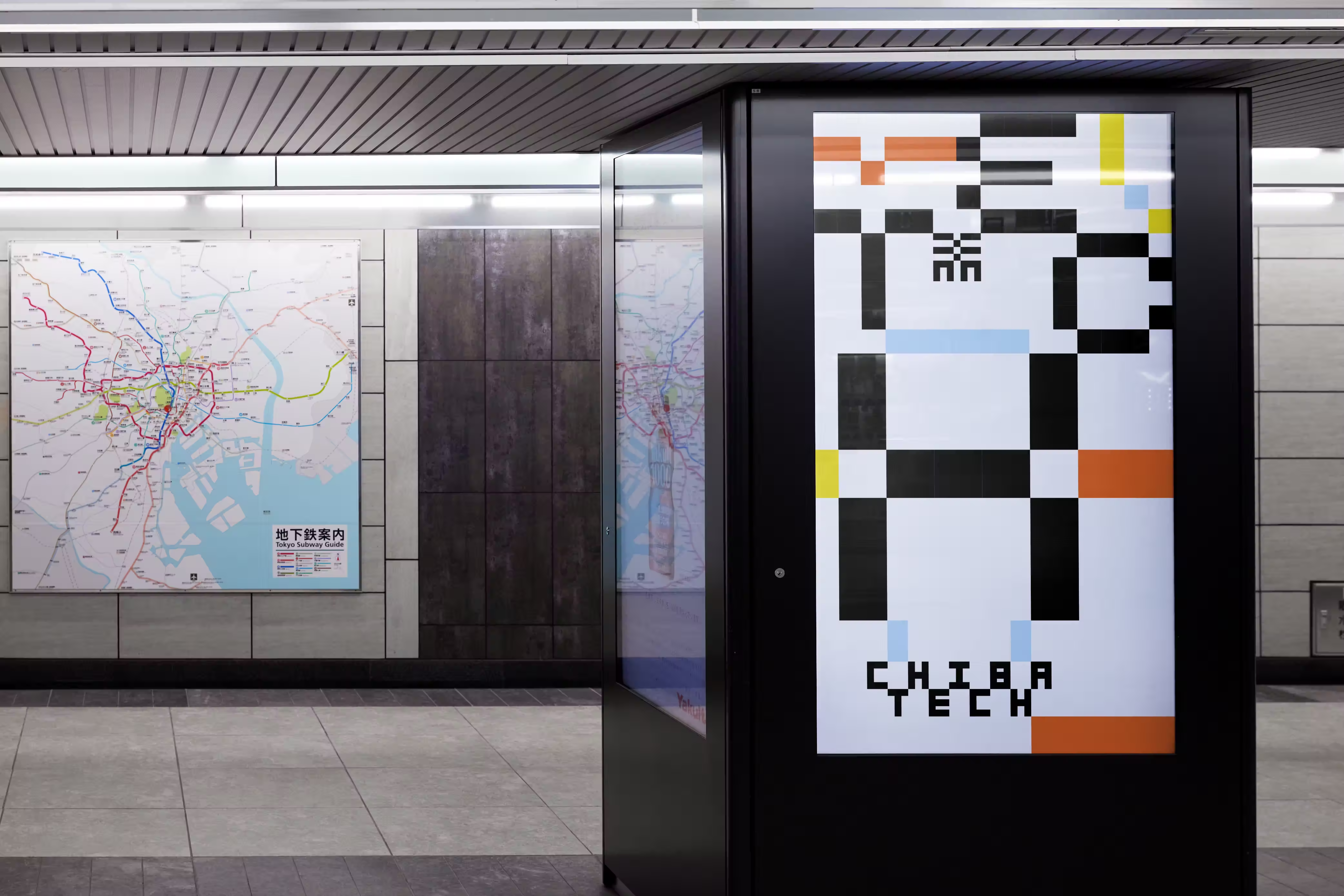
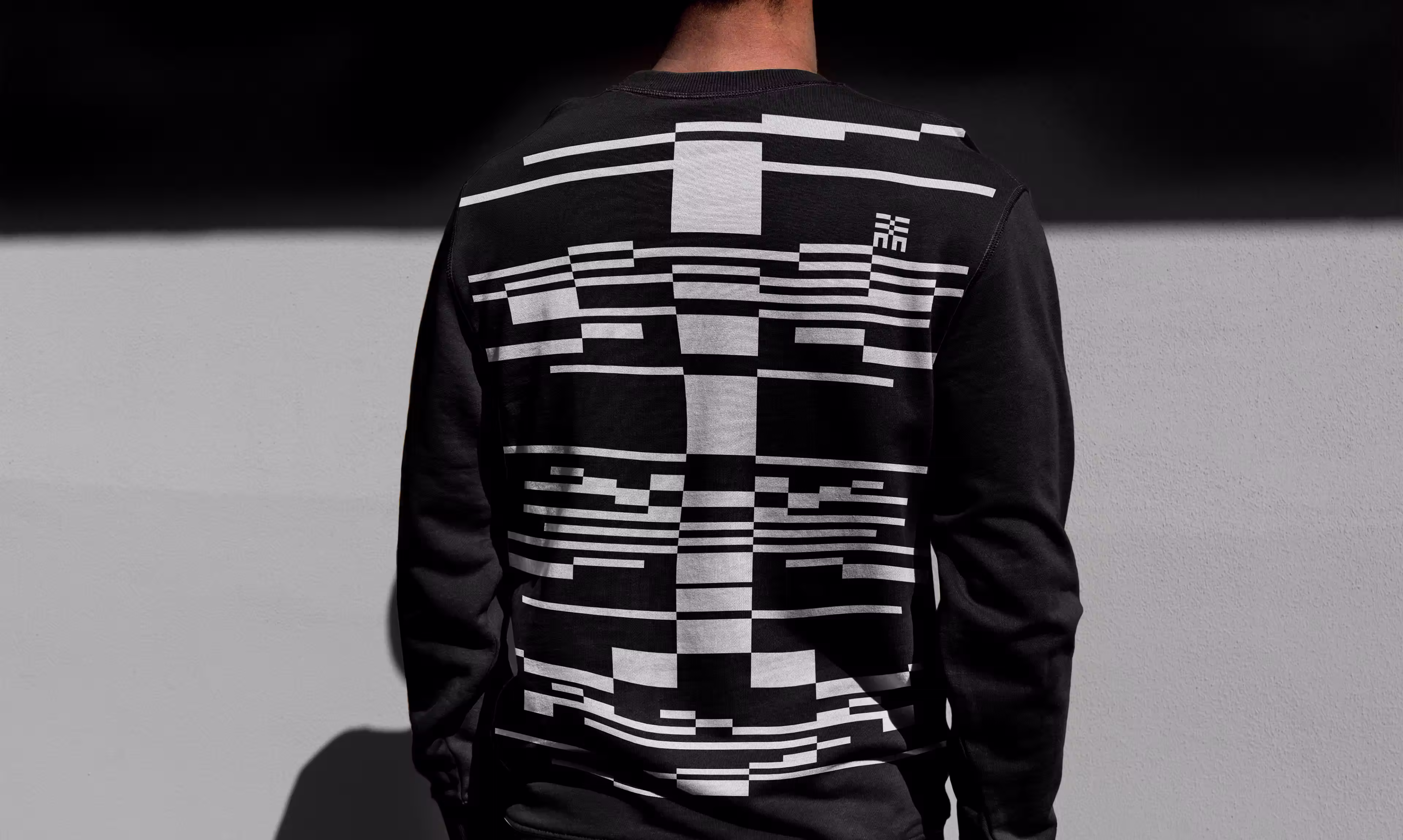
The identity centers the core character as typography, logo, mascot, and the structure of its reactive design system.
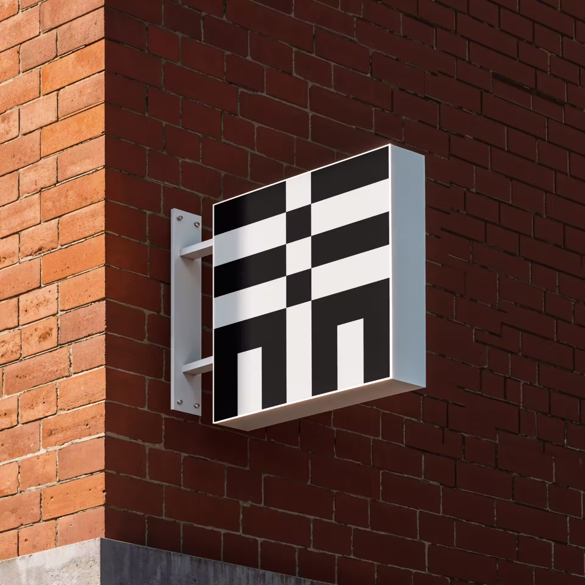
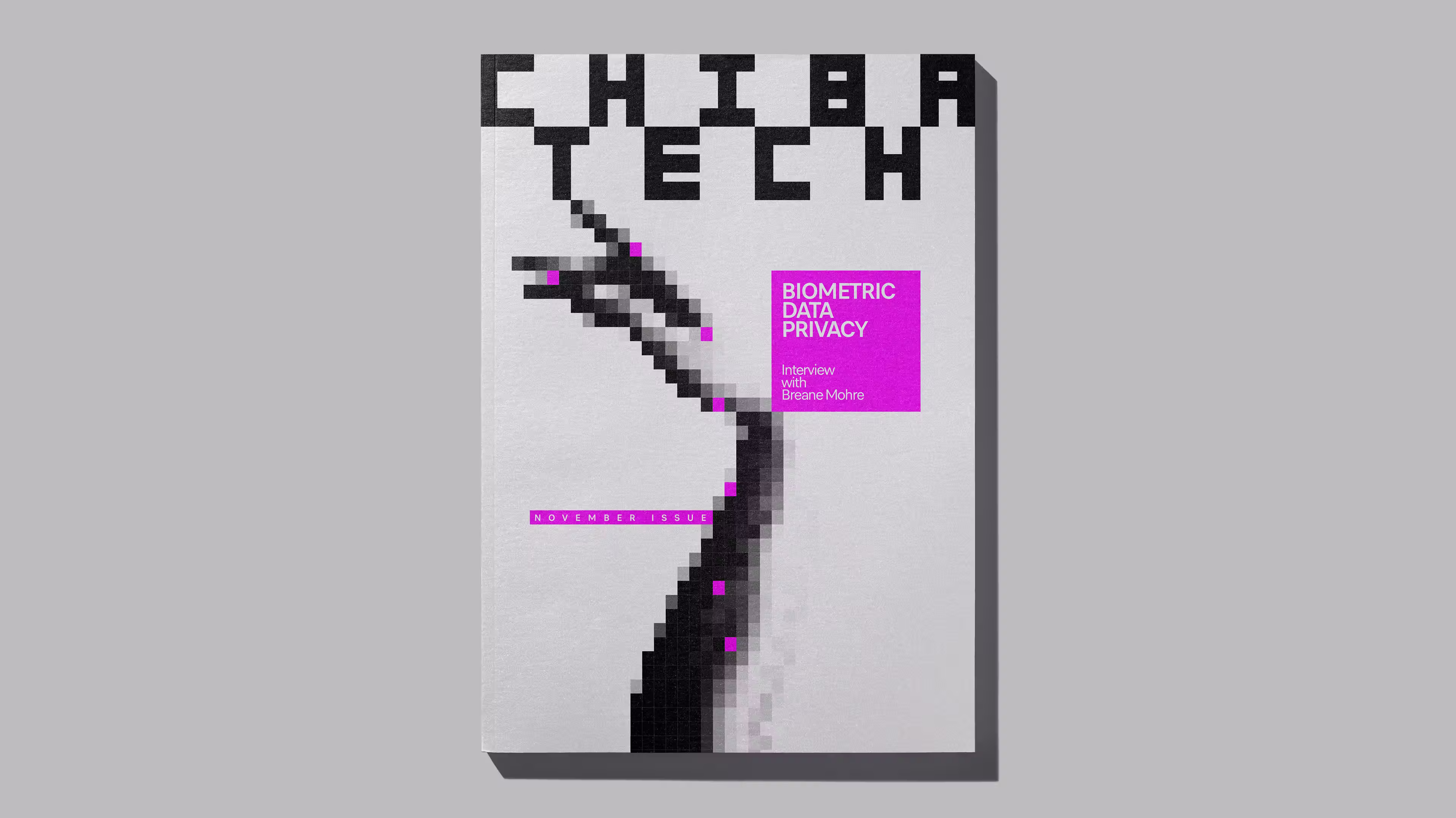
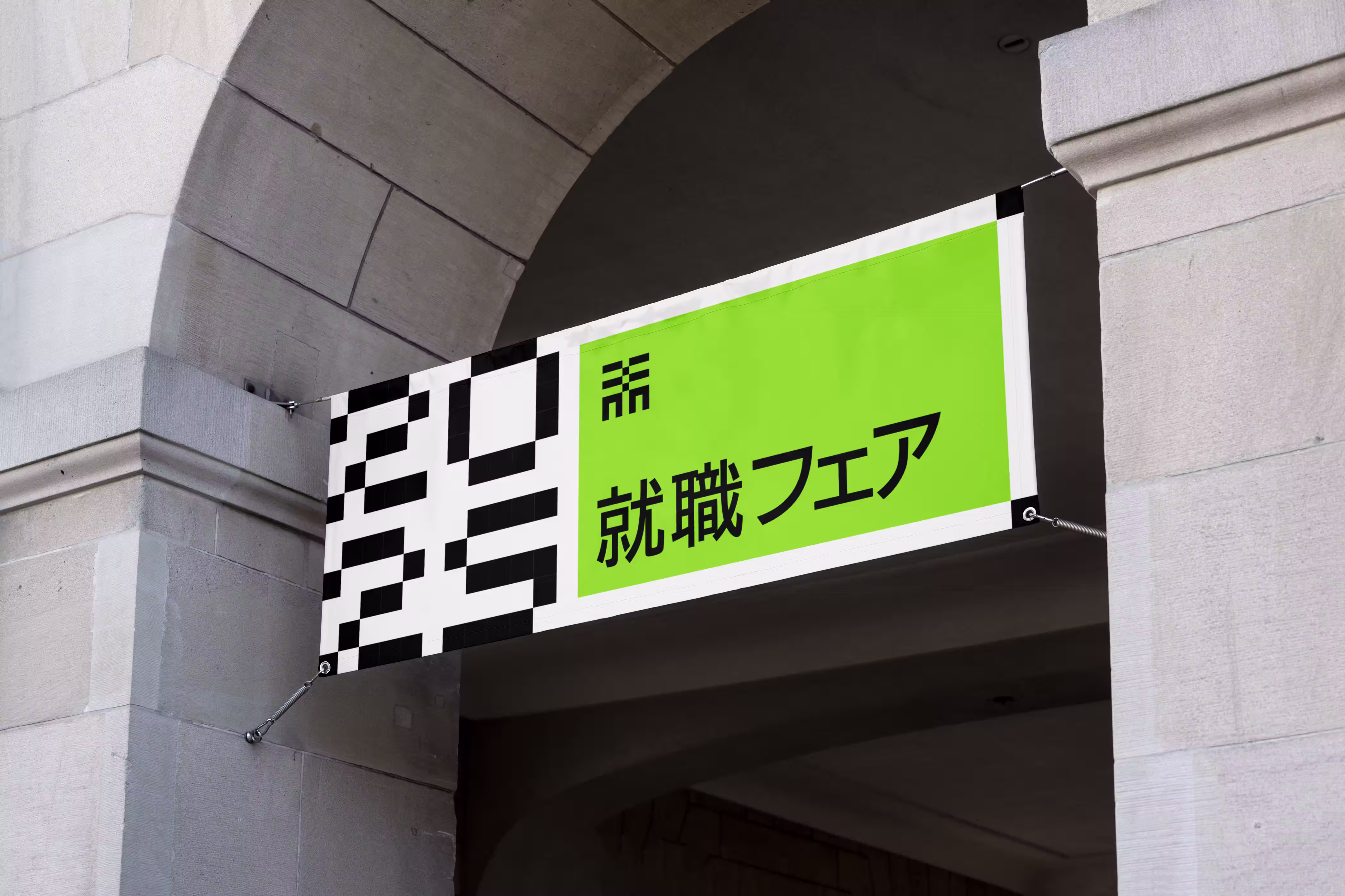
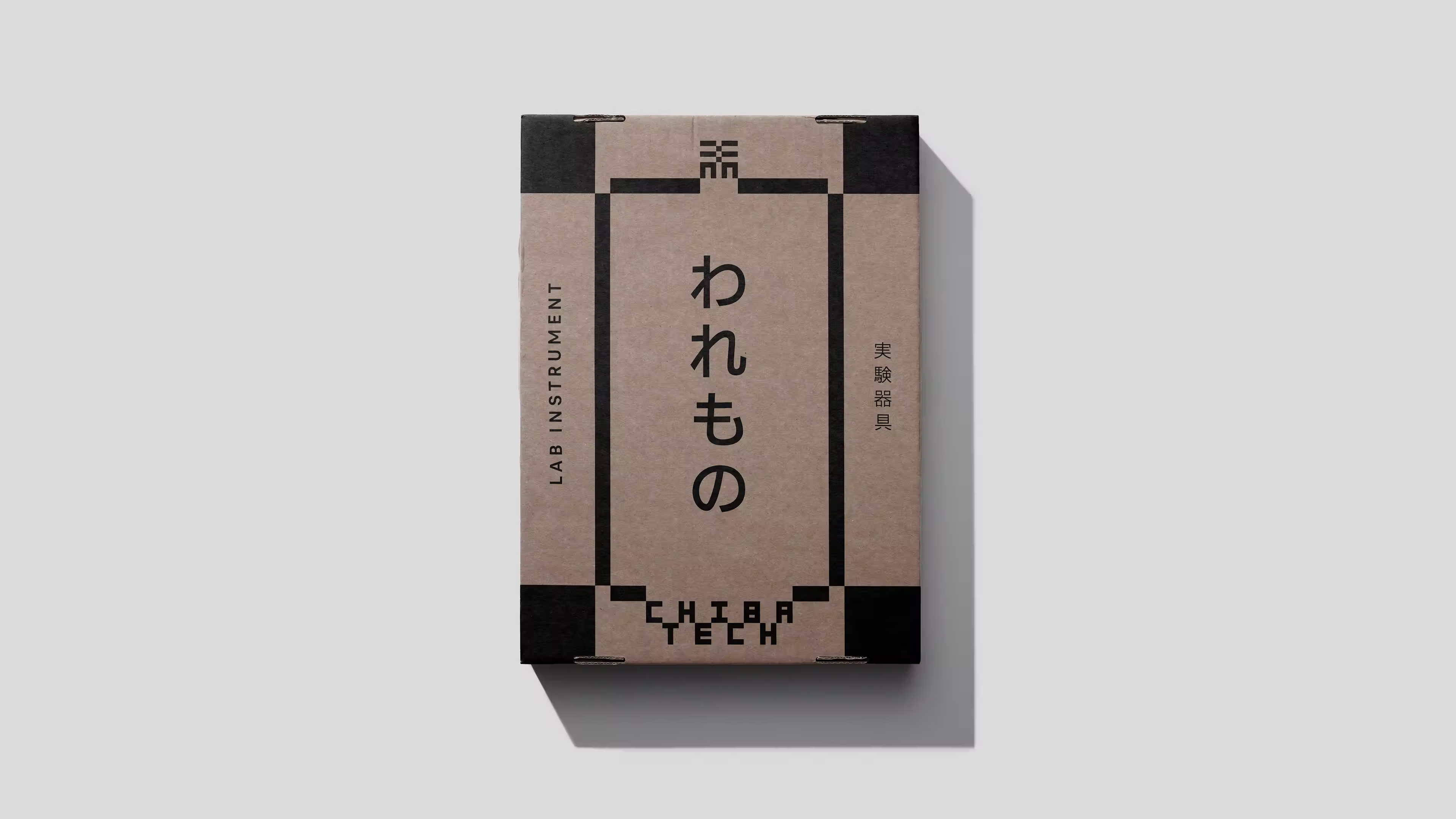
The character was modernized through clean, geometric forms inspired by the ichimatsu moyo (市松模様) checker pattern, which represents uninterrupted prosperity and growth.
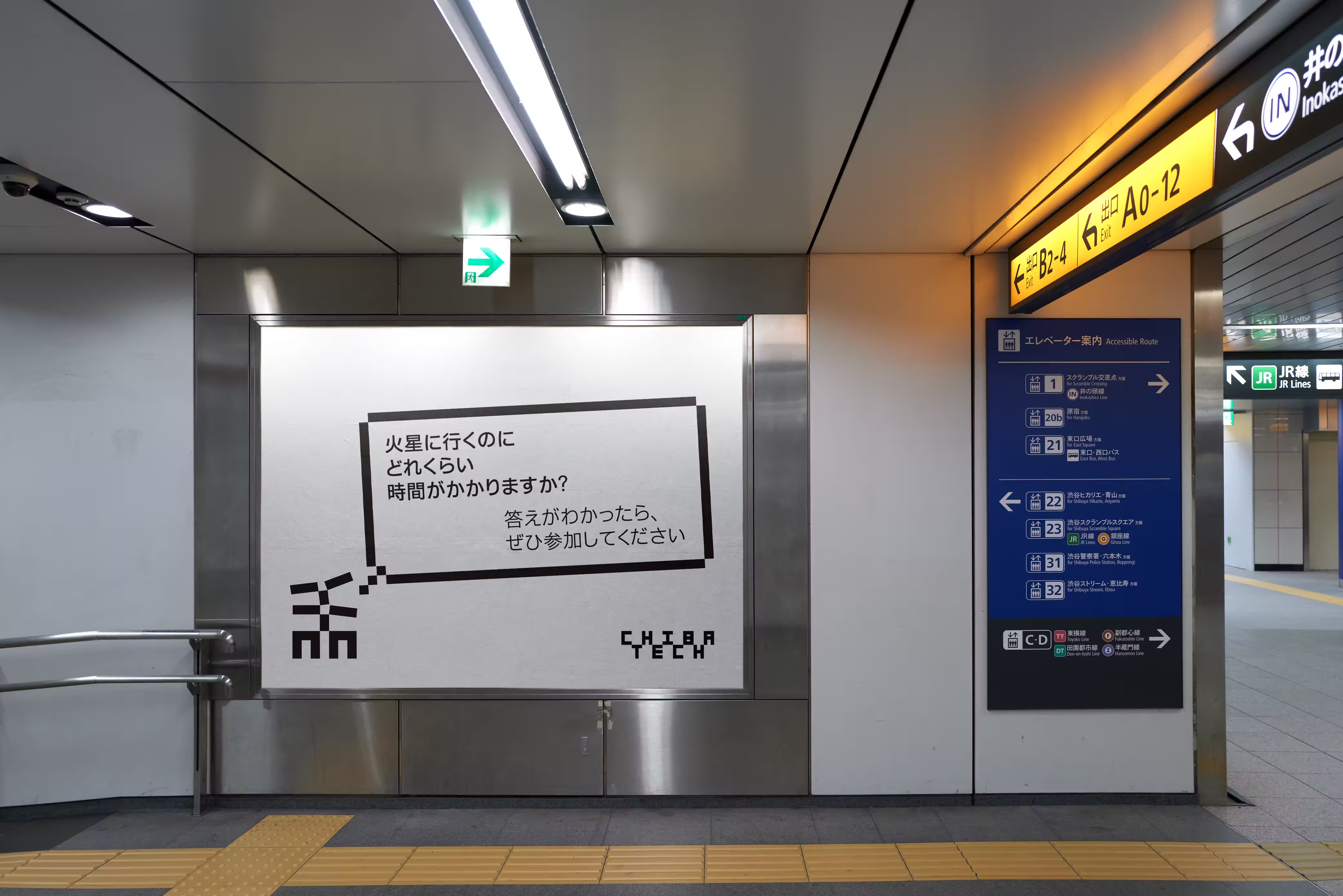
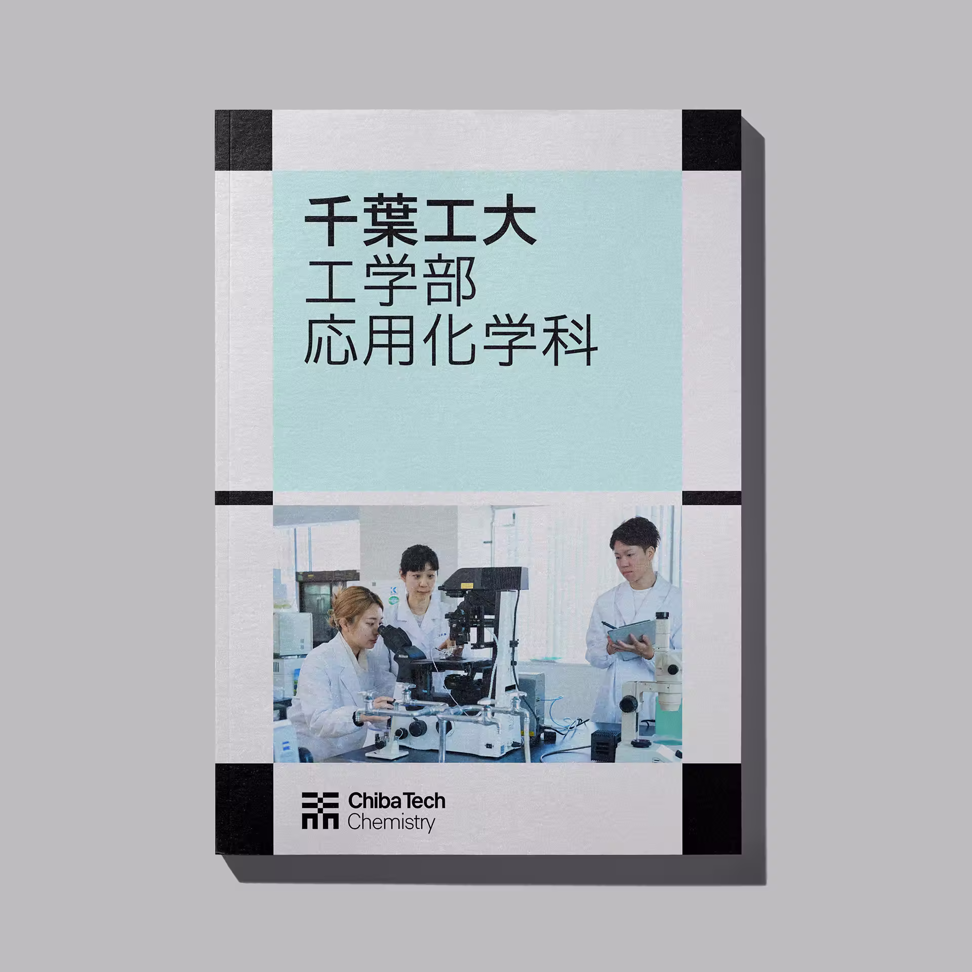
In layouts, the character defines a grid system grounded in the four corners, articulating consistency, craft, and modulation.
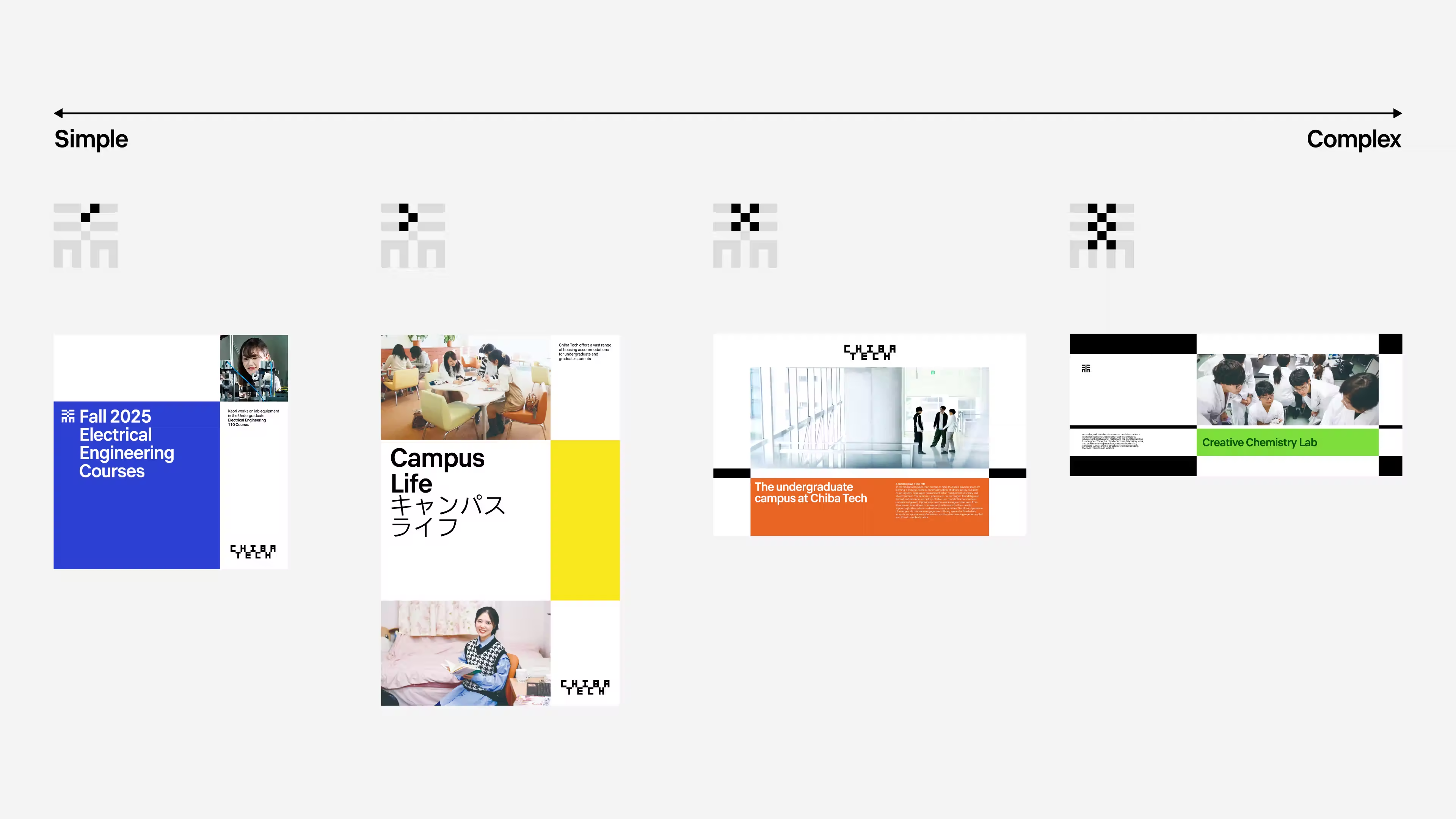
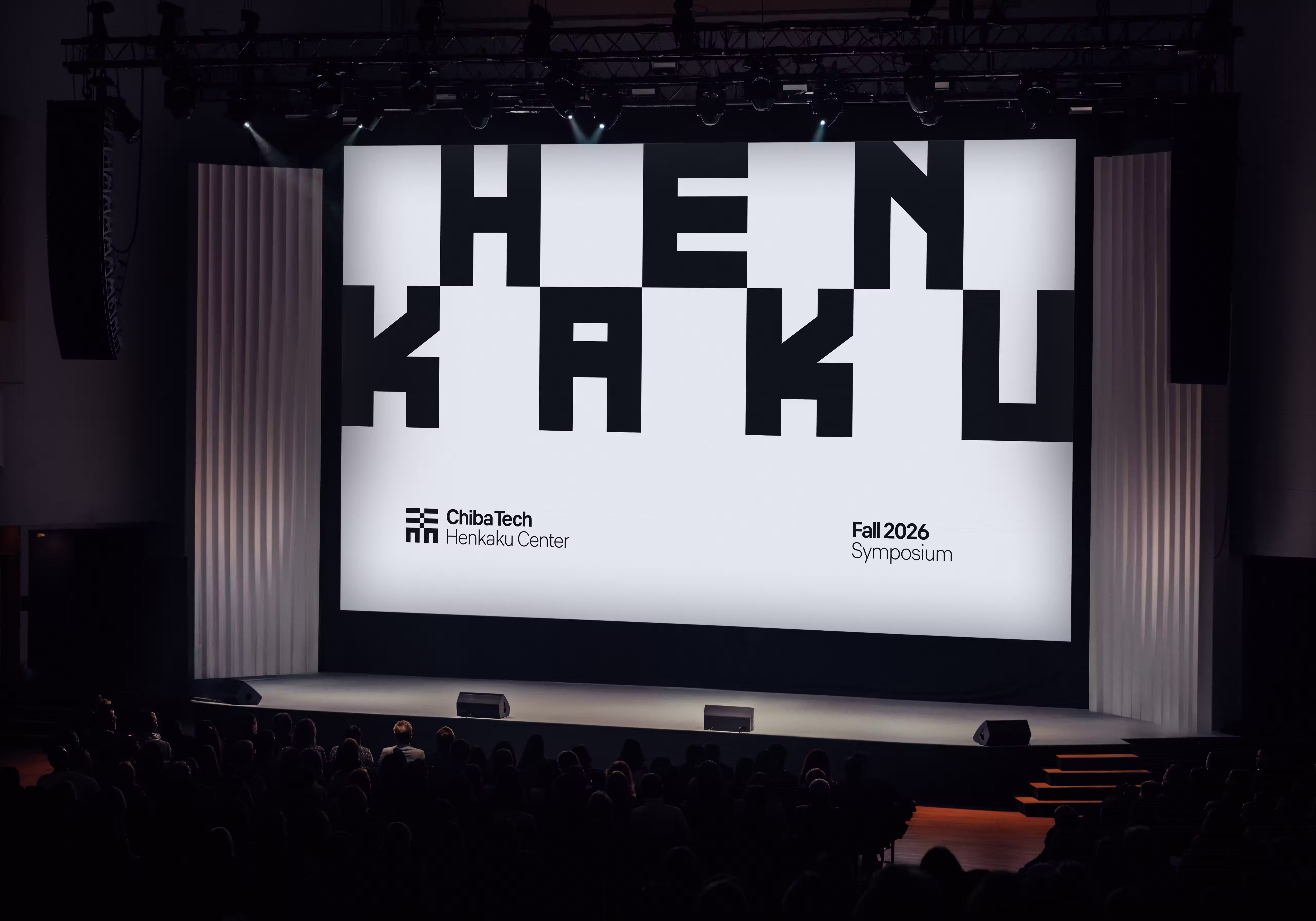
Stretching and adapting across content and scale, this modularity becomes a metaphor for Chiba Tech’s global partnerships.
This graphic methodology-symbol as layout-enables the brand to extend beyond prescriptive layouts and reach more nuanced visual territories.
The color palette uses a proprietary zig-zag method that enables a wide array of color combinations.